Mayor’s Office of
Children & Family Success
Website Redesign
This UX/UI project was a long duration redesign of an outdated website along with new branding that required months of research and planning in order to maximize the reach potential of end users. Items considered included: restructure to sitemap, section 508 compliance with web contrast, custom CSS Google translate on all web pages, button hover state changes + unique identifying colors to match various assistance programs, search feature.

Competitive Audit
Before jumping into design, I first looked at other city organizations, both in the government and non-profit sector. Key considerations were: accessibility, ease of the navigation, search functionality and presentation of resources.
I looked at the New York Office of Children and Family Services. This site was within the larger NY government website, which meant that all of the information was condensed onto one page. The site was broken into key categories: Resources, News, Information and then a sitemap of many links. Since MOCFS was going to be a larger website, I still thought about the categories that the NY office called out and how MOCFS will feature them.


Flow
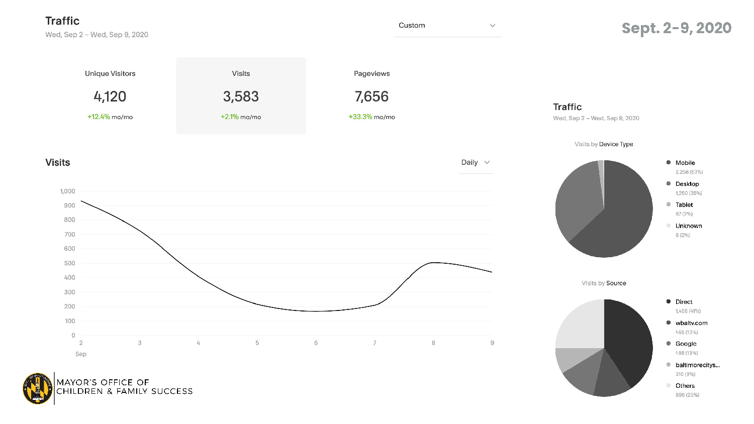
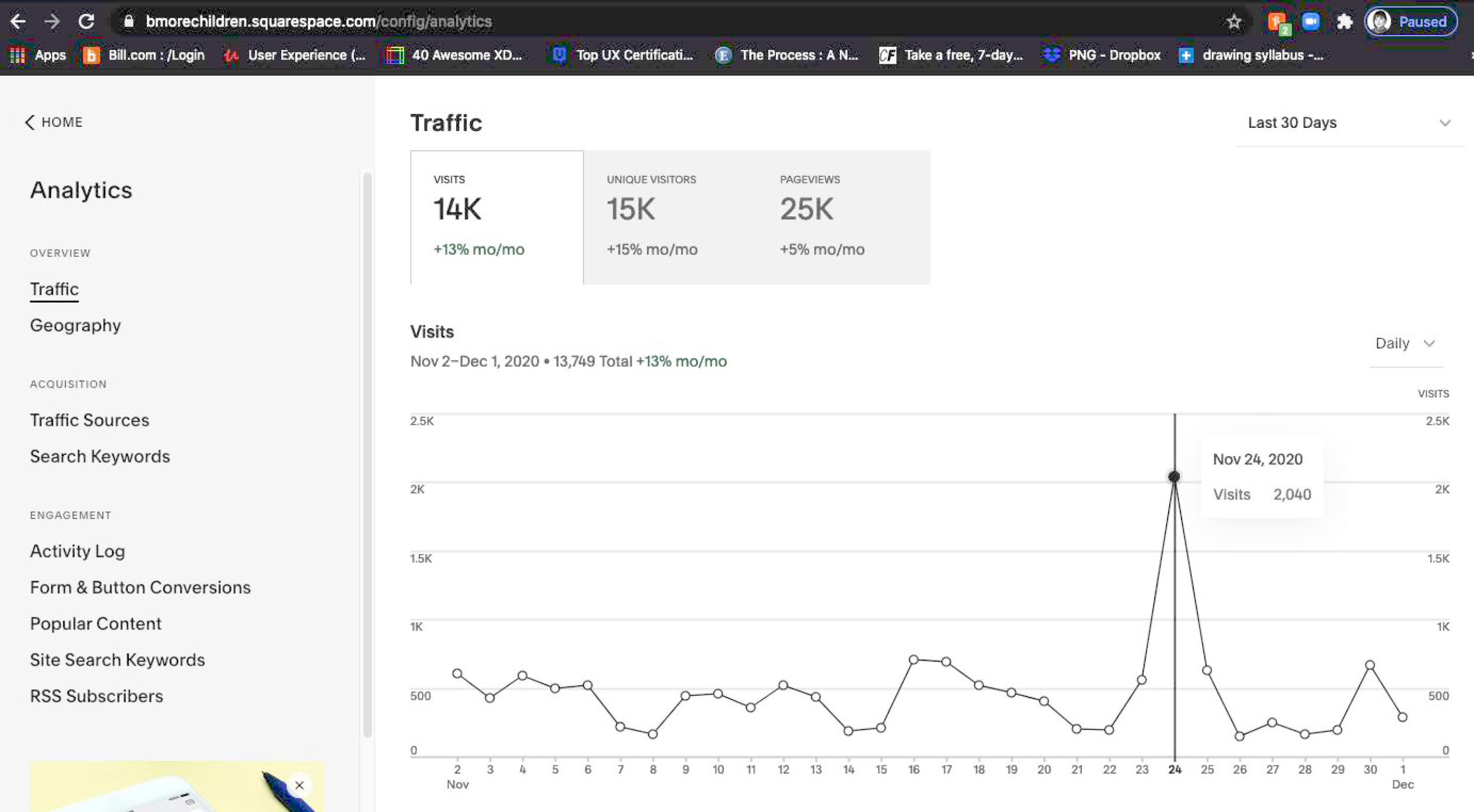
In rebuilding the sitemap, I worked closely with the Director of Communications. One of the things that I wanted to consider when restructuring the navigation and content flow was website analytics. Where are people going when they visit the current site and what information needs to be prominent and easy to find? I made sure to check these throughout the website redesign process. Data for August 2020 and November 2020 are below. What was clear is that visitors needed quick information for Eviction Prevention and Meals for Families.


Framing
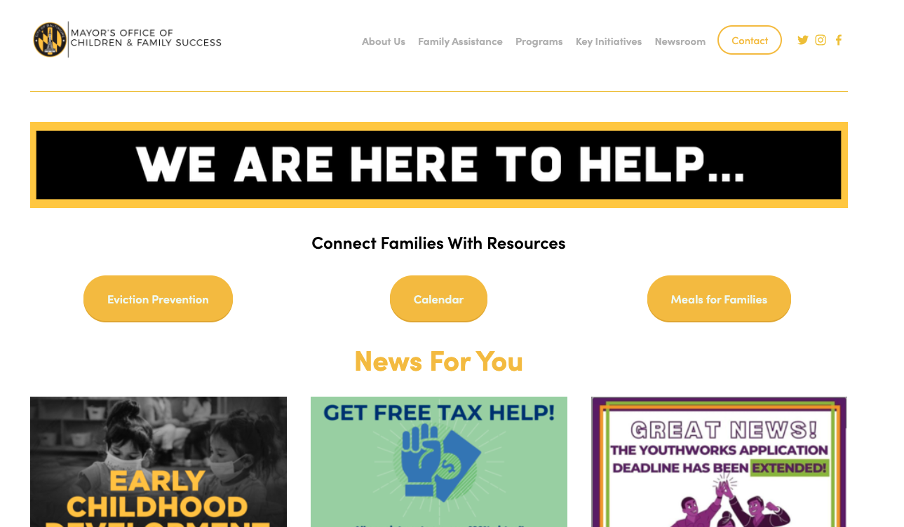
In reframing the website, I wanted to make sure that the homepage captivated the user, inviting them into the website so that they felt certain that the services being offered to them came from a safe place they can trust. The analytics showed that many of the sites visitors were in need of assistance. I felt that a larger hero slideshow would create a personal connection for the visitor. I thought about the competitive audit of the NY office and how news and resources were prominent. I used data and research to inform the new framework of the homepage.

Homepage Before


Homepage After
Design
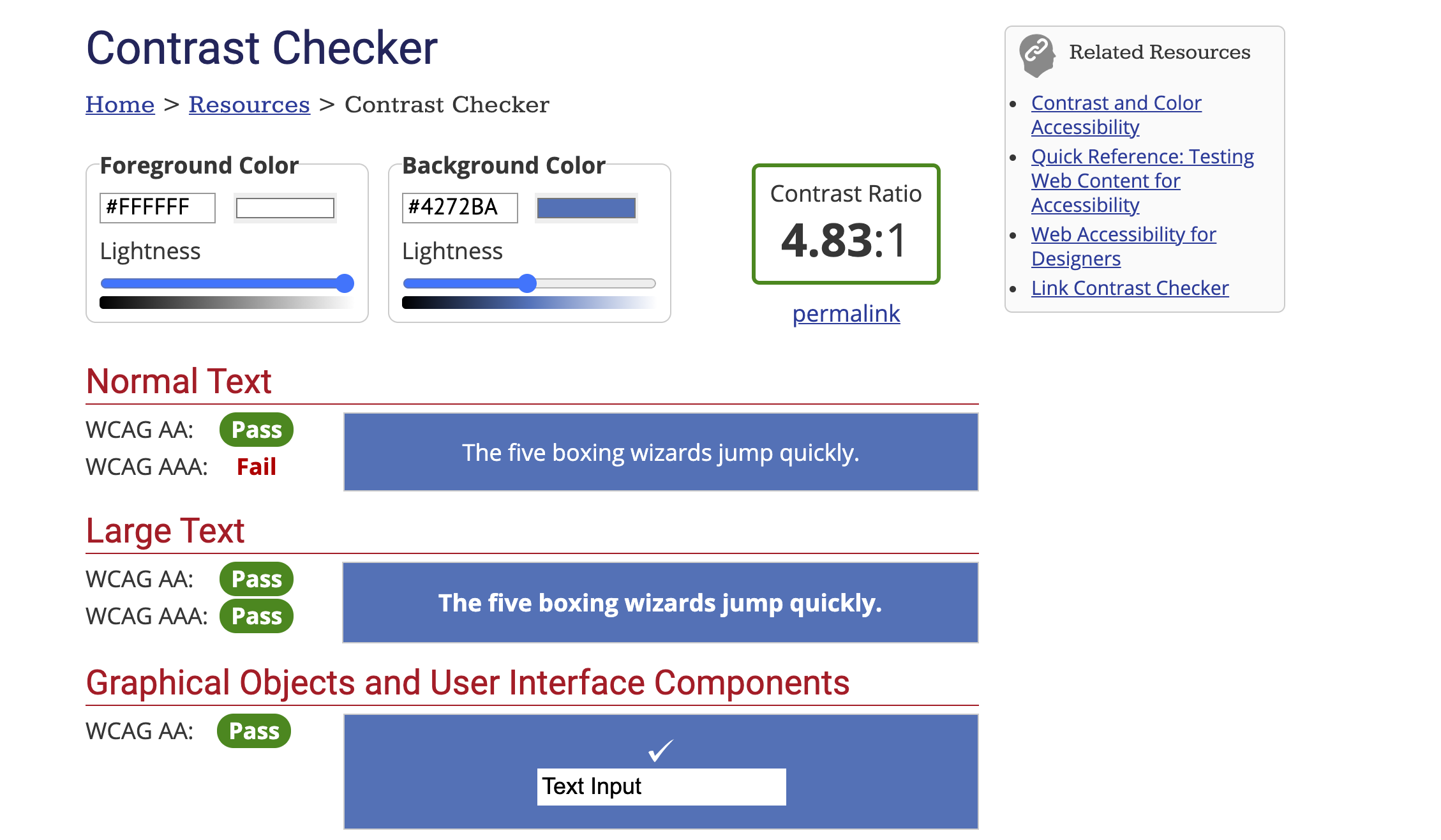
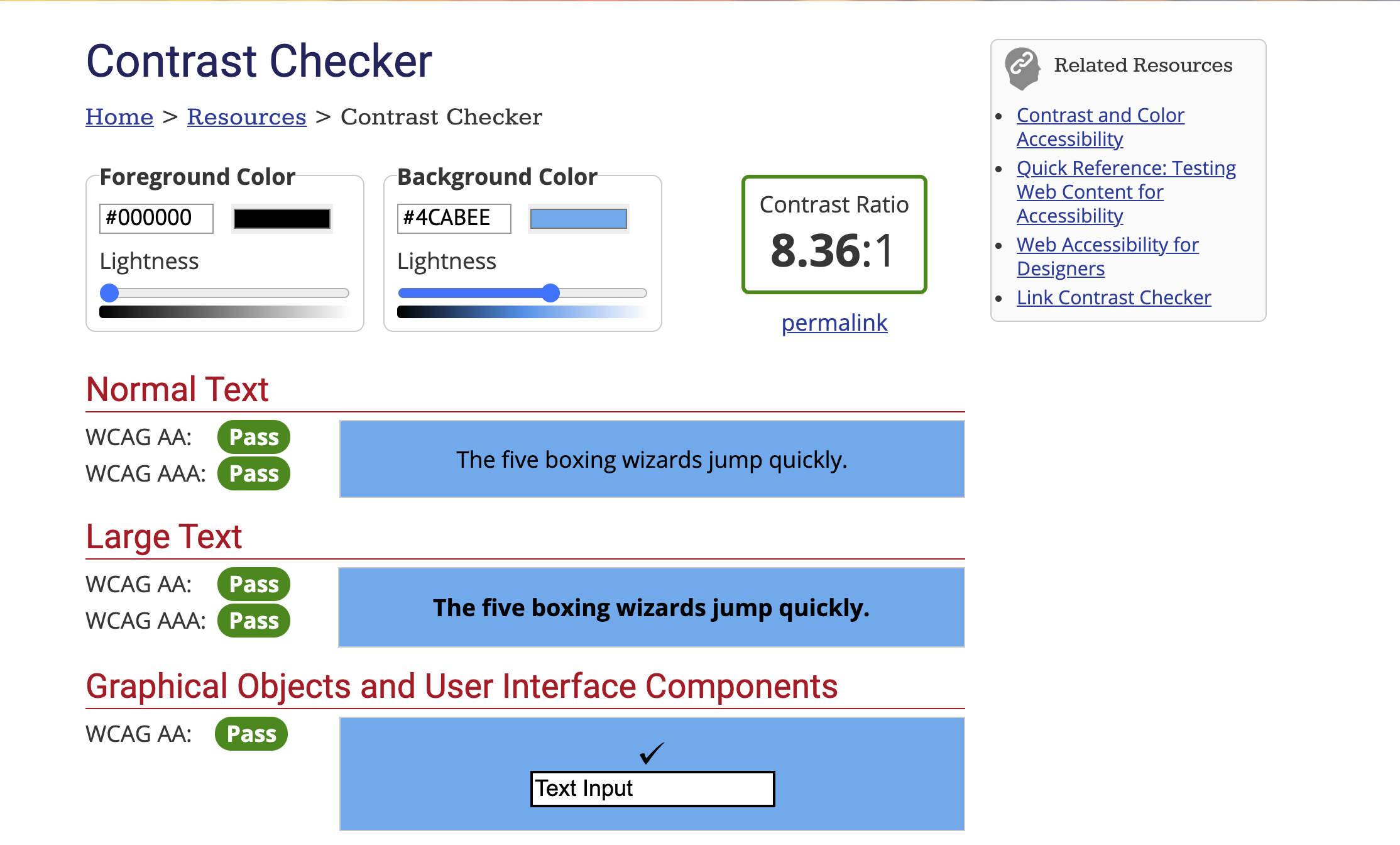
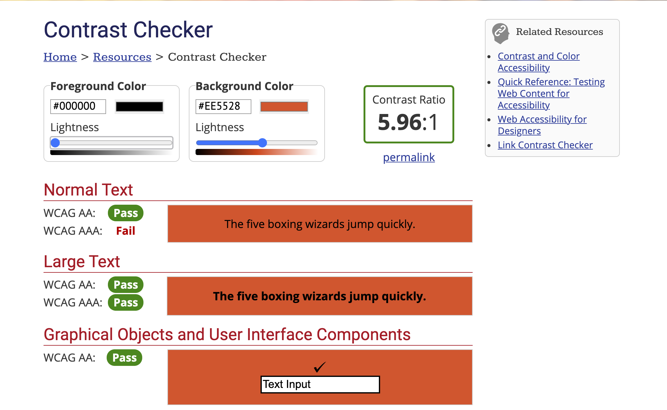
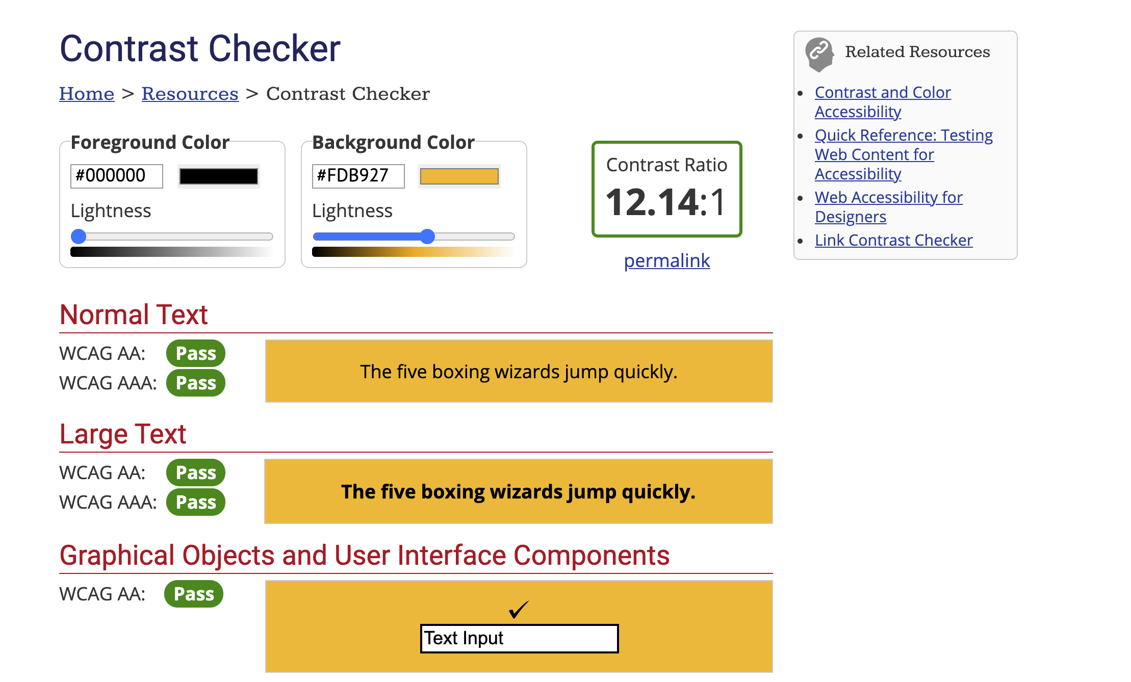
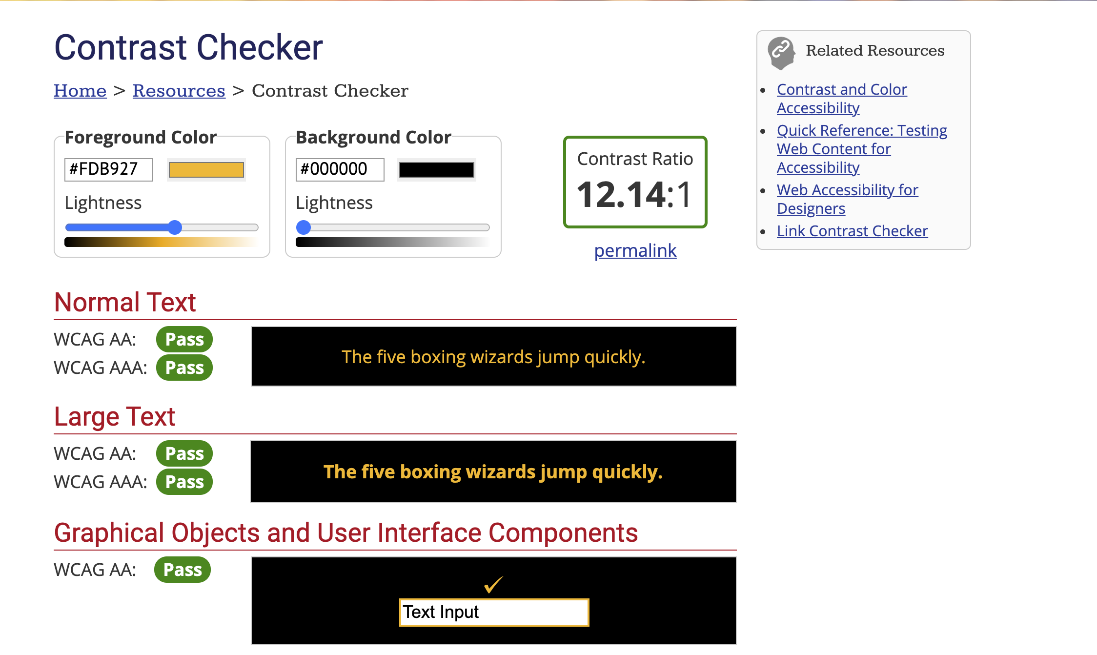
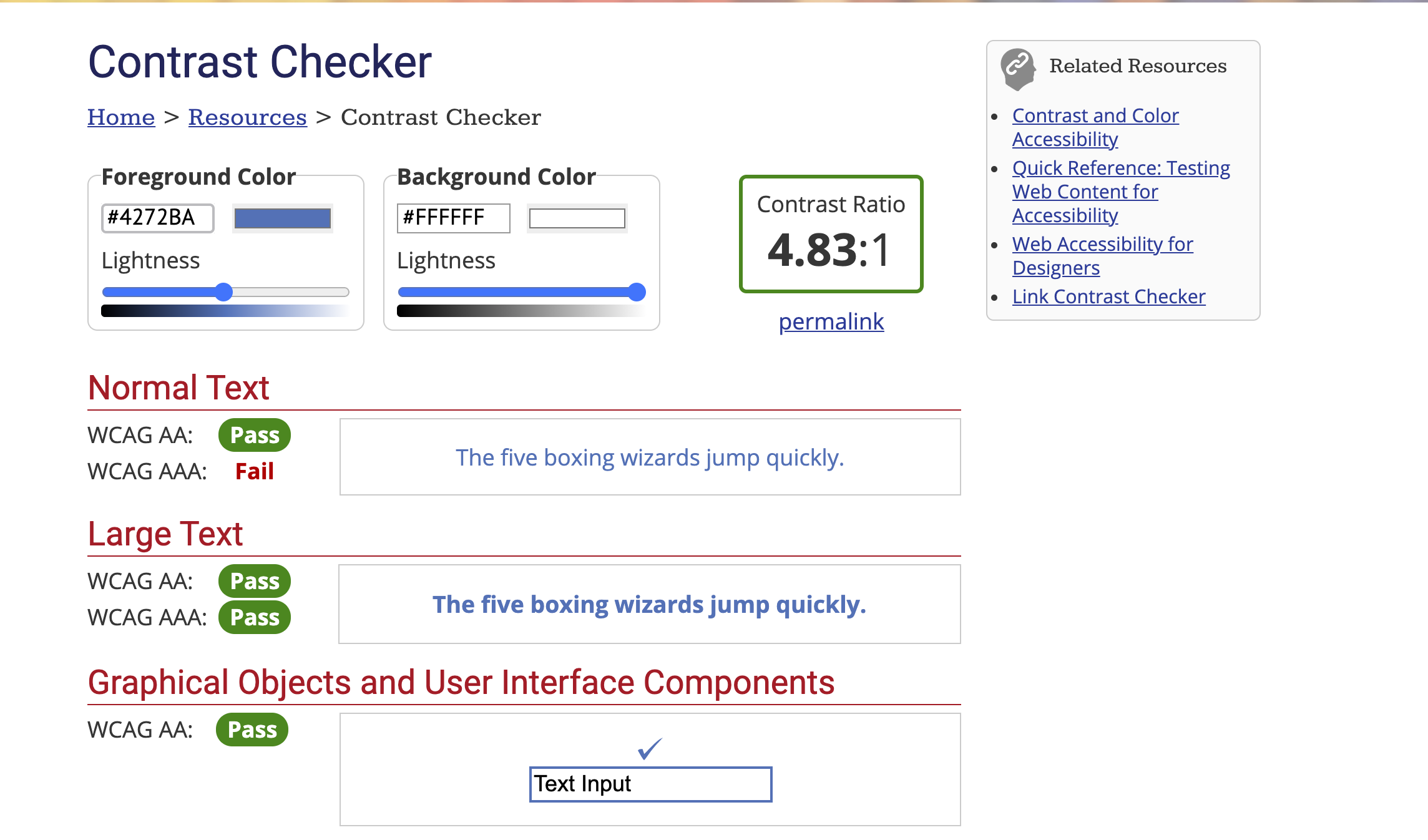
During the redesign of the website, MOCFS partnered with local design organization, Points North, to develop a new logo and branding for the agency. I used the new color scheme as the basis for the major components within the new site and made sure to check for WCAG AA and WCAG AAA because I knew that the current site failed. I worked with Points North through this process to align the website to their recommendations and brand direction.
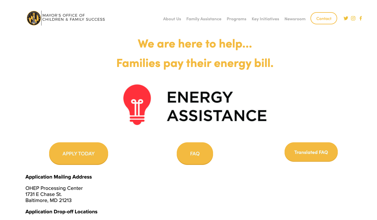
Additionally, on the new site I added CSS on every page for Google translate. The 5 most common languages in Baltimore outside of English are Spanish, French, Korean, Mandarin and Arabic. Rather than recreating each page with a toggle between languages, I added the CSS so that any page can be translated into over 50 languages with the click of a button. I added this in the same location of each page directly under the hero image on the right side (image above on right).
Website Before
Section 508 Compliance - Contrast Check
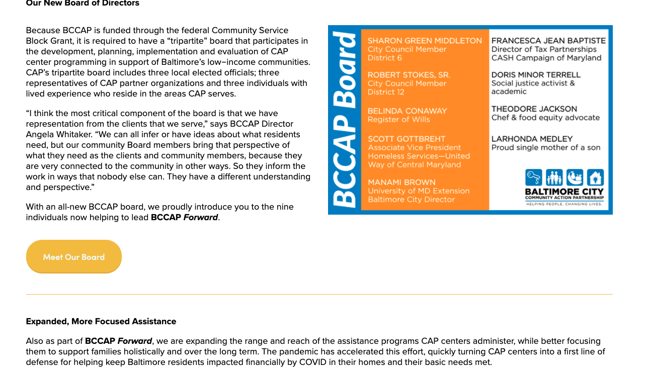
Outcomes
There are several takeaways from this project that are worth mentioning. One is that the analytics of the site were invaluable to the restructuring of the sitemap. Using the data over several months to show user flow of the current site helped me in determining which information to give attention to on the homepage and how to reorient the navigation. Two is the update for contrast compliance and language translation capabilities on every webpage. Since this website sees a lot of traffic and provides necessary resources to the residents of Baltimore City, it is important that the information is easily accessible.
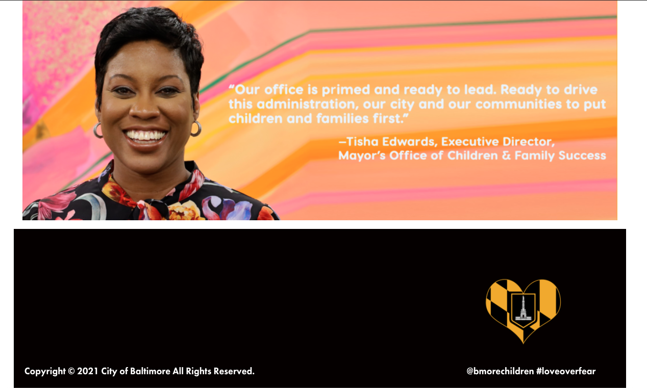
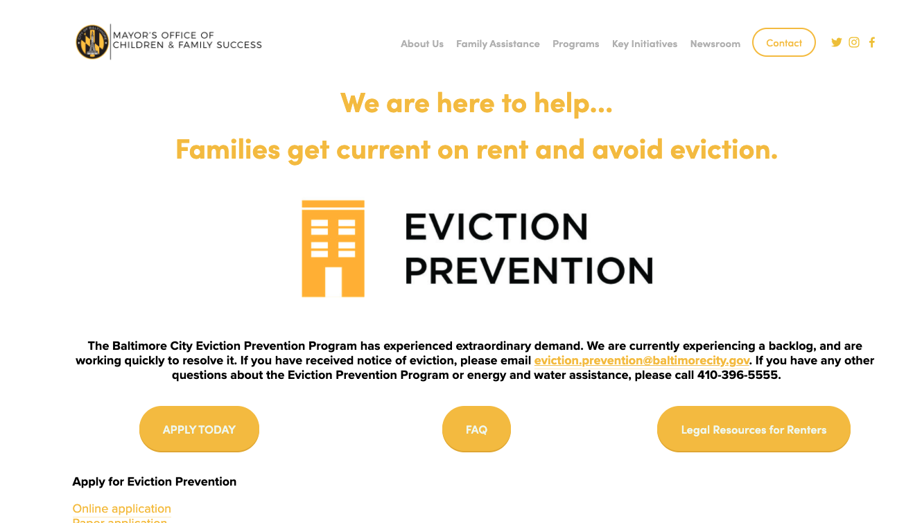
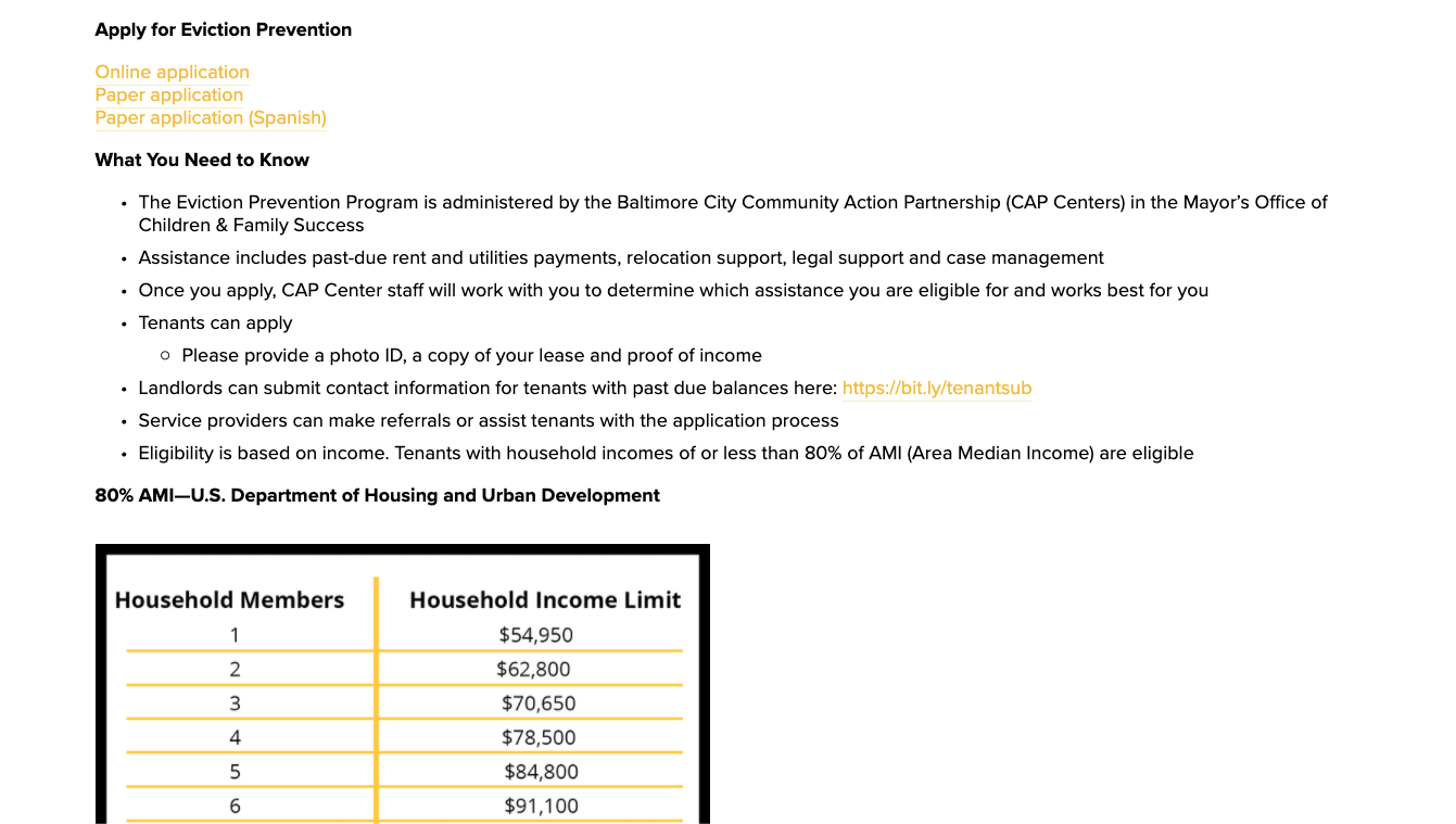
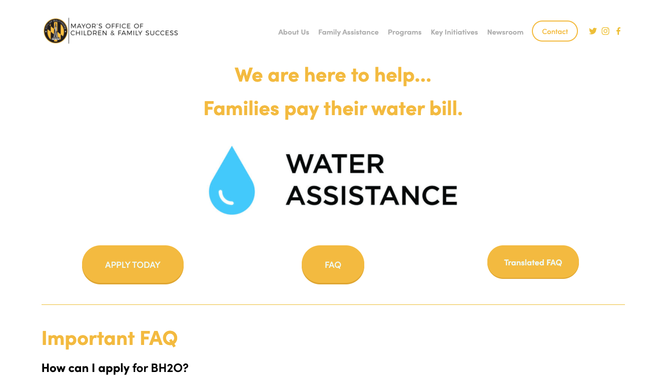
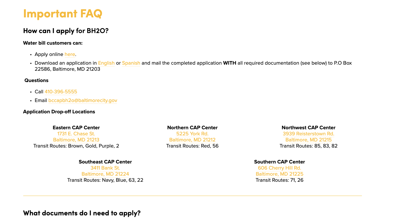
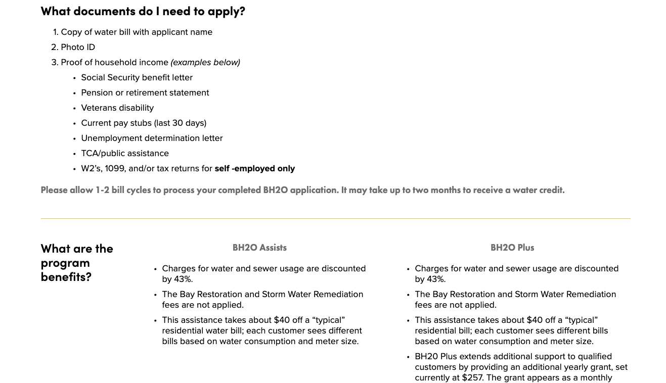
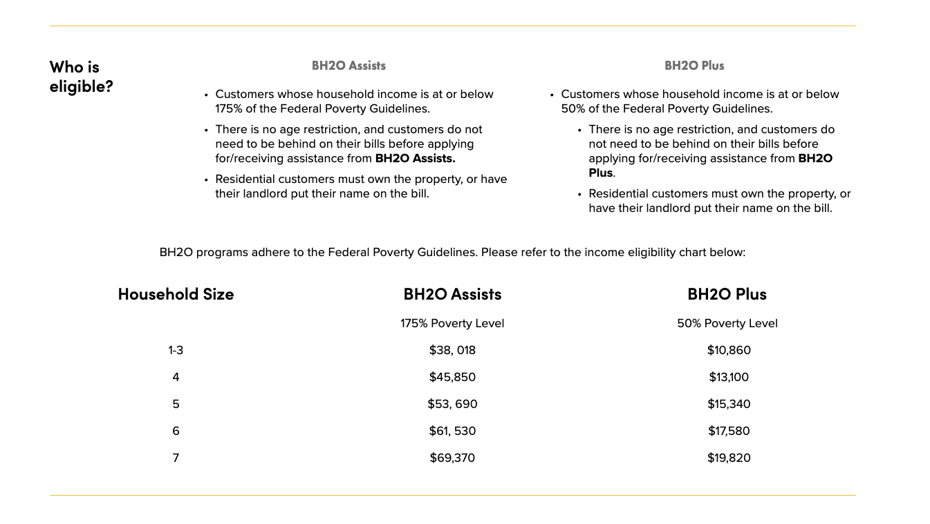
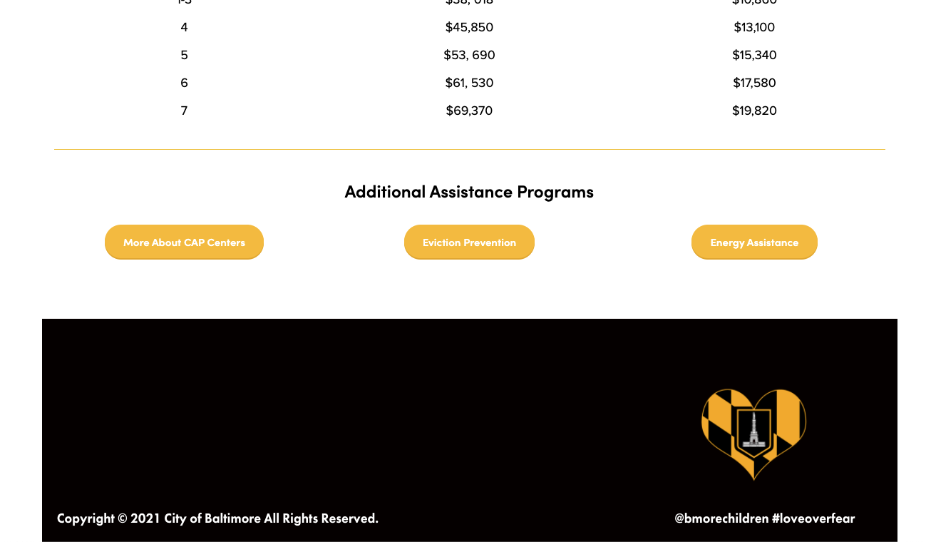
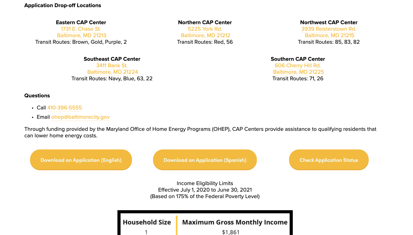
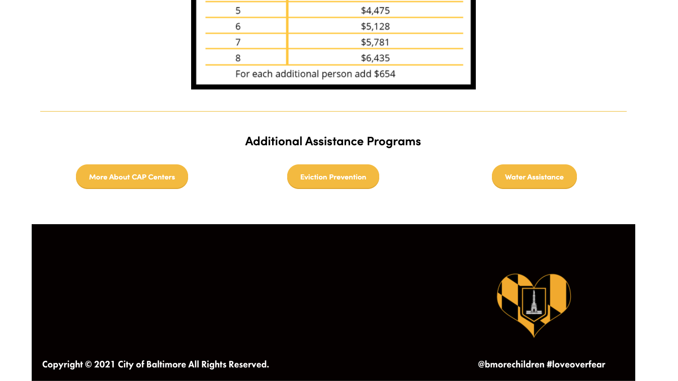
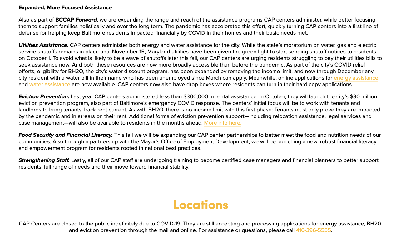
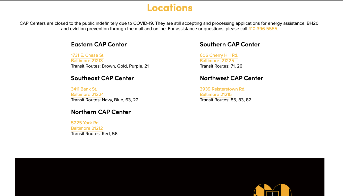
Another area of accessibility that needed work were the resources pages. The old site featured 3 separate webpages for each program. On the current site, the information is provided in a way that is more clear and easy-to-use and all on one page. The old Eviction Prevention webpage had a lot of text and was trying to reach multiple audiences: resident, community partners, other agencies, etc. It was cumbersome to navigate and hard to tell what was of use to the main user, the resident. The new site offers links for application and contact information, and the program press releases are now located on a separate Newsroom webpage. Lastly, adding a touch of the community on every page. The design thread throughout the website are various murals that exist(ed) in the city. Every main webpage features a mural as the page hero image so that the Baltimore City community has prominence throughout in a unique way.
Baltimore AfterSchool Programs (BAP)
Many teenagers lack access to after school activities that provide mentoring, tutoring and nutritious food access. BAP is a mobile application designed to allow teenagers access to local programs after school in their neighborhood using geolocation. The app features a feed of classes and workshops, organization profiles with contact information, and directions to the sites via public transportation or walking. The website, featured below, is an added layer to this project and provides information about the application, programs, news & events and a donation link.

Competitive Audit
For this project, I looked into apps that were providing youth with opportunities in their communities after school. The one closest to the goals of BAP was Spotivity, an app based in Chicago. This app did many of the same things that I was hoping to achieve here with BAP. The key difference was that the design was not youth-centric and the interactivity and search filters were not as in-depth.


Flow
After spending time with Spotivity and thinking about what it is that BAP needs to achieve, I make a flowchart to think through how someone would sign up and join. I also considered the main features that are needed: activity feed, user profile, community organization site profile, and map with public transportation access.

Framing
After I thought through the steps and interaction between screens, I started to make rough sketches of potential wireframes for initial discovery screens. I moved from sketch to wireframe in Adobe XD to start and build components.


Design
Once I developed components and several screen wireframes, I began brainstorming a design system that could work. I took into consideration what I learned my the competitive analysis and decided to make the overall look and feel more youthful and wanted it to feel connected to Baltimore City. I used the Baltimore Ravens color palette with a playful logo with an overall sans serif for the header and body copy. I used various color combinations to provide contrast and interactivity throughout the app design.


Prototype & Outcomes
When building out the prototype, I wanted to make sure that navigating the app was seamless. I also wanted to make sure that the app successfully provided youth with a way to connect with community organizations based on their interests, and provided directions based on walking or public transportation.

The BAP Feed
Designed with the flow of Instagram in mind, the feed systems is meant to highlight local organizations events and workshops that are happening daily.

Navigation
Using geo-location, the app is meant to provide easy directions to each organization site using walking or local public transportation methods.

Profiles
Each organization has a brief profile page to highlight contact information and site details that a user can use to interact with the site via hyperlinks.
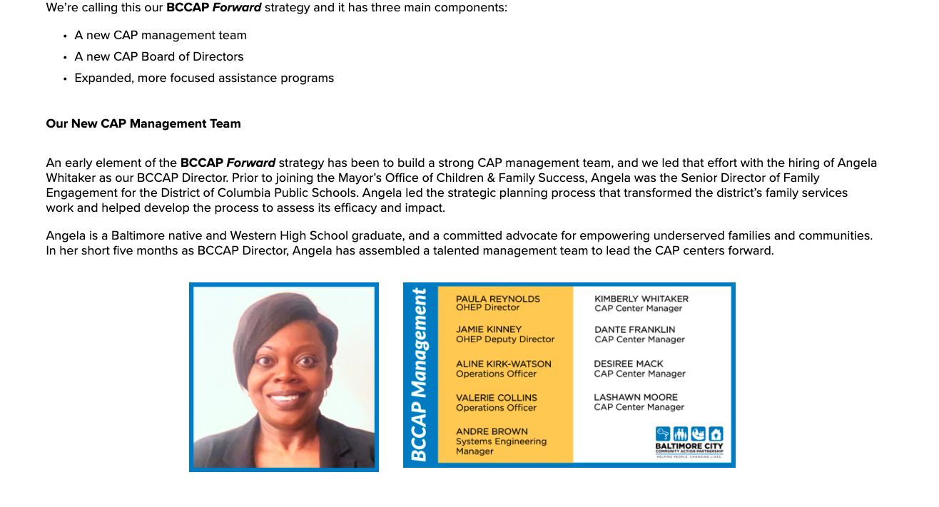
Website

Website

Website
Website
Website
Website
Leasing Packet
Leasing Packet
Leasing Packet
Leasing Packet
Leasing Packet
Leasing Packet
Leasing Packet
Leasing Packet
Leasing Packet
Leasing Packet
Leasing Packet
Leasing Packet
Leasing Packet
Leasing Packet
Leasing Packet
Leasing Packet
Leasing Packet
Leasing Packet
Leasing Packet
Leasing Packet
Leasing Packet
Leasing Packet
Leasing Packet
Leasing Packet
Lookbook
Lookbook
Lookbook
Lookbook
Lookbook
Lookbook
Lookbook
Lookbook
Lookbook
i solve problems through design.
also find me on linkedin:
THINGS TO KNOW ABOUT ME
An intermedia artist trained in all things UI/UX design, I am well-versed in web design, particularly using WordPress and Squarespace. I am trained in videography and editing, primarily in Adobe Premiere Pro, with interest in documentation recording. Additionally, I have experience in graphic design and branding, primarily for real estate, hospitality and restaurant management, law, healthcare and wellness.
A love of clean and consistent design, coherent branding, and a drive to learn new software and technology when needed. Rarely a flawed designer, sometimes an adjunct professor, always a cat & dog lover and foodie enthusiast.
I currently live and work in Baltimore, Maryland. I have a Master of Fine Arts in Intermedia and Digital Arts from the University of Maryland Baltimore County. I also have a Master of Fine Arts in New Media from the George Washington University